Objective:
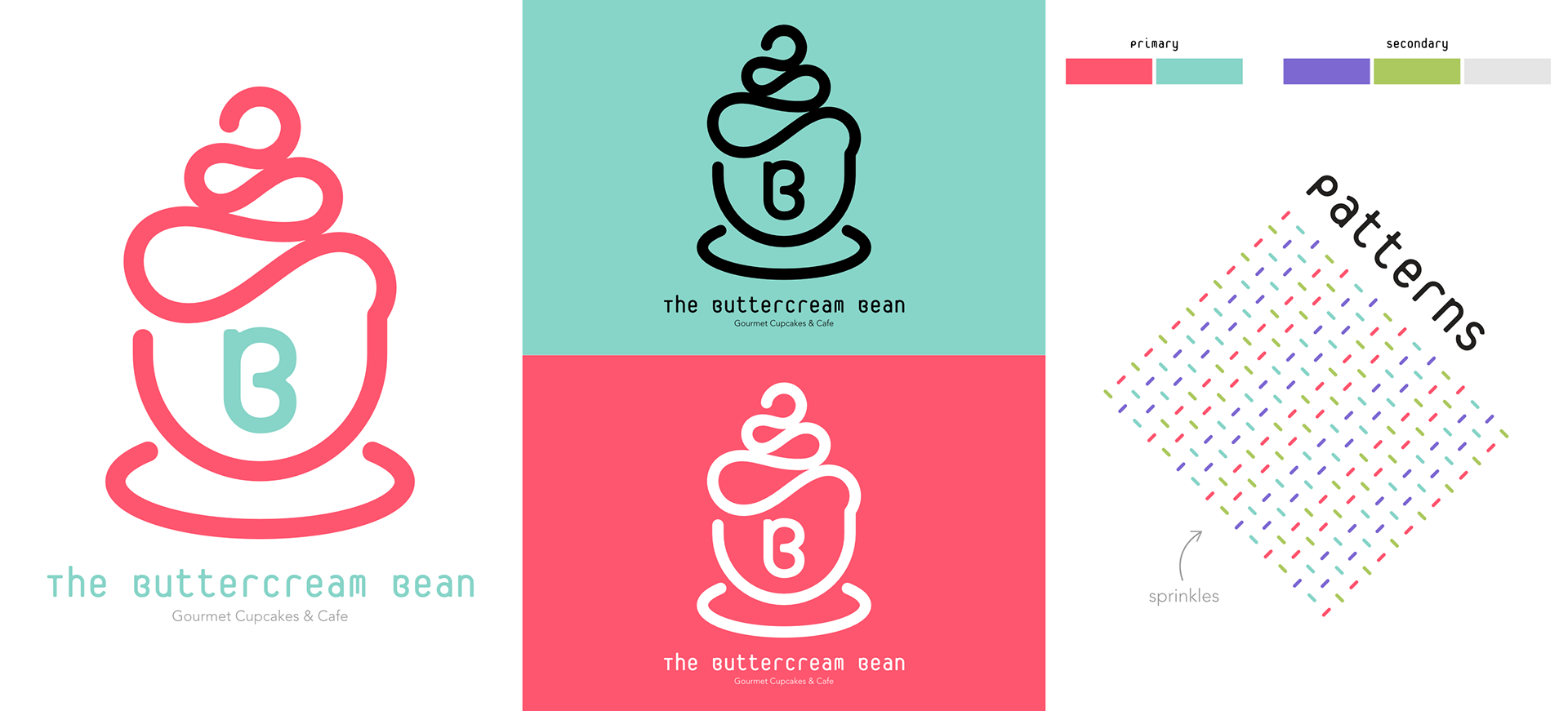
Develop the branding for a fictional cafe with a twist. This example combines a regular cafe with specialty cupcakes.
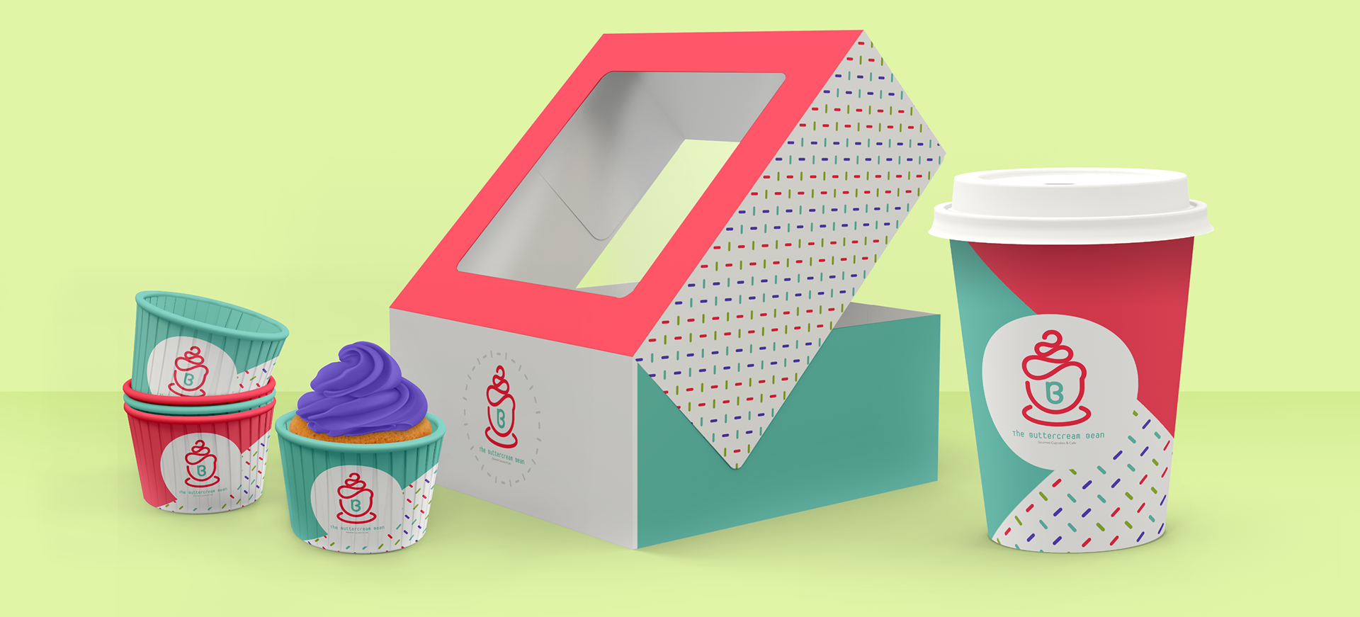
The overall idea behind this design was to create something colorful, fun, and appropriate for all ages to enjoy. To attain this goal I used rounded edges and a bright color scheme that would communicate happiness and joy.
The logo itself combines a cup of coffee with a cupcake in a clean and recognizable way. The font I chose to accompany the visual portion of the logo is unique but readable, and felt a bit child-like without being child-ish. I also included a branded pattern in the presentation and packaging design that resembles sprinkles and is meant to compliment the other pieces of branding.
Along with the branding presentation, I have included sample packaging for cupcake cups, boxes, and disposable coffee cups. The packaging uses the various branding elements in a way that differentiates the individual items but is still cohesive to communicate a consistent brand experience.